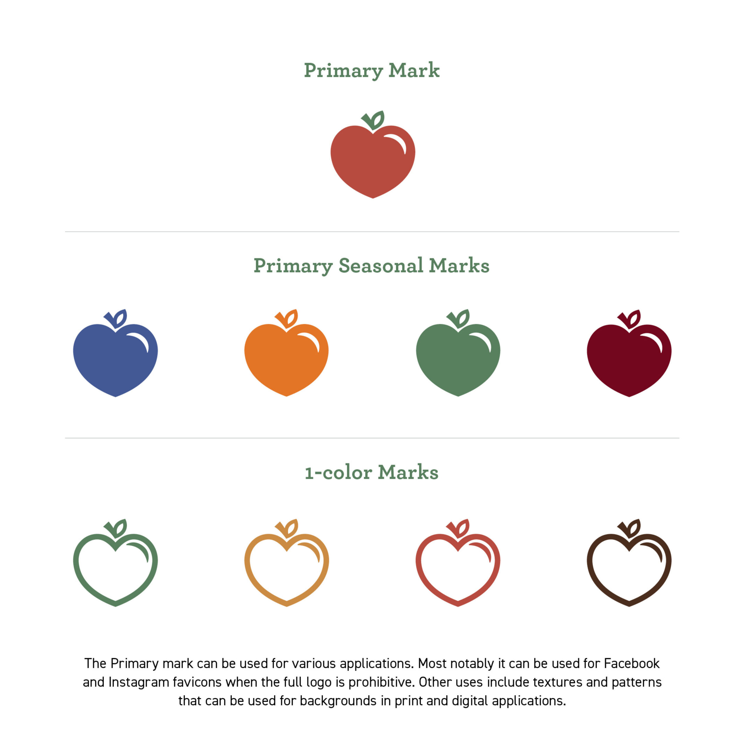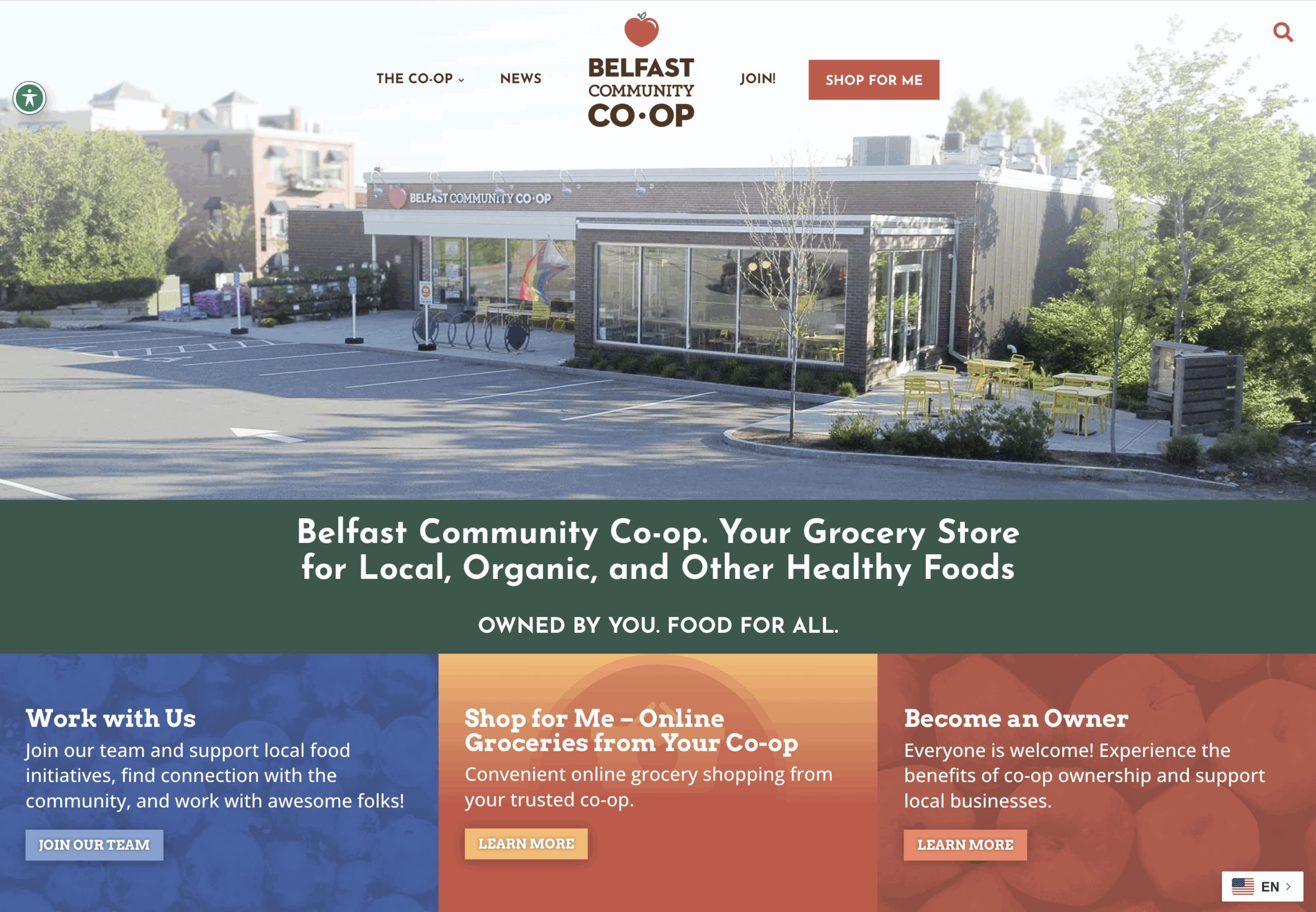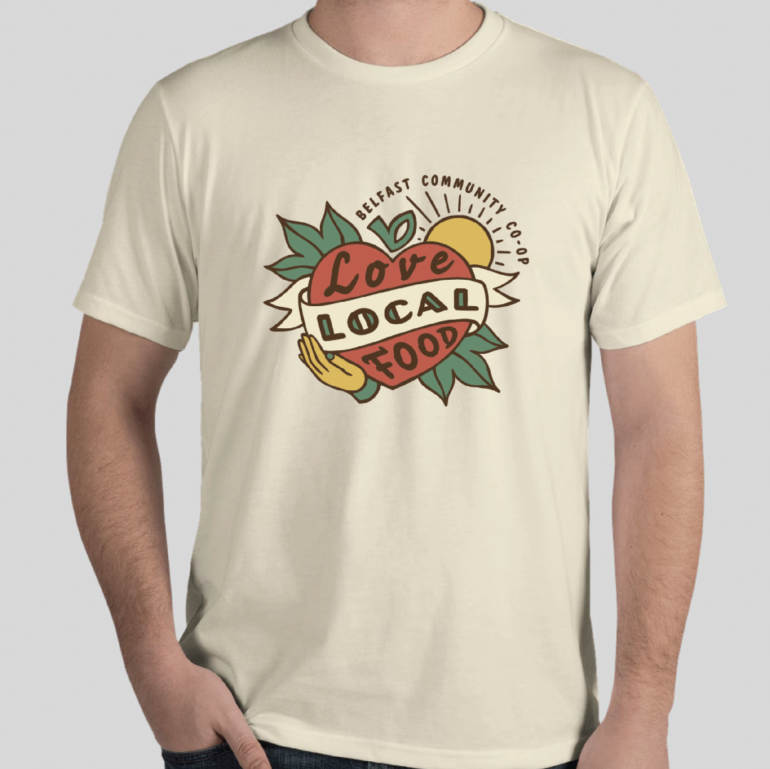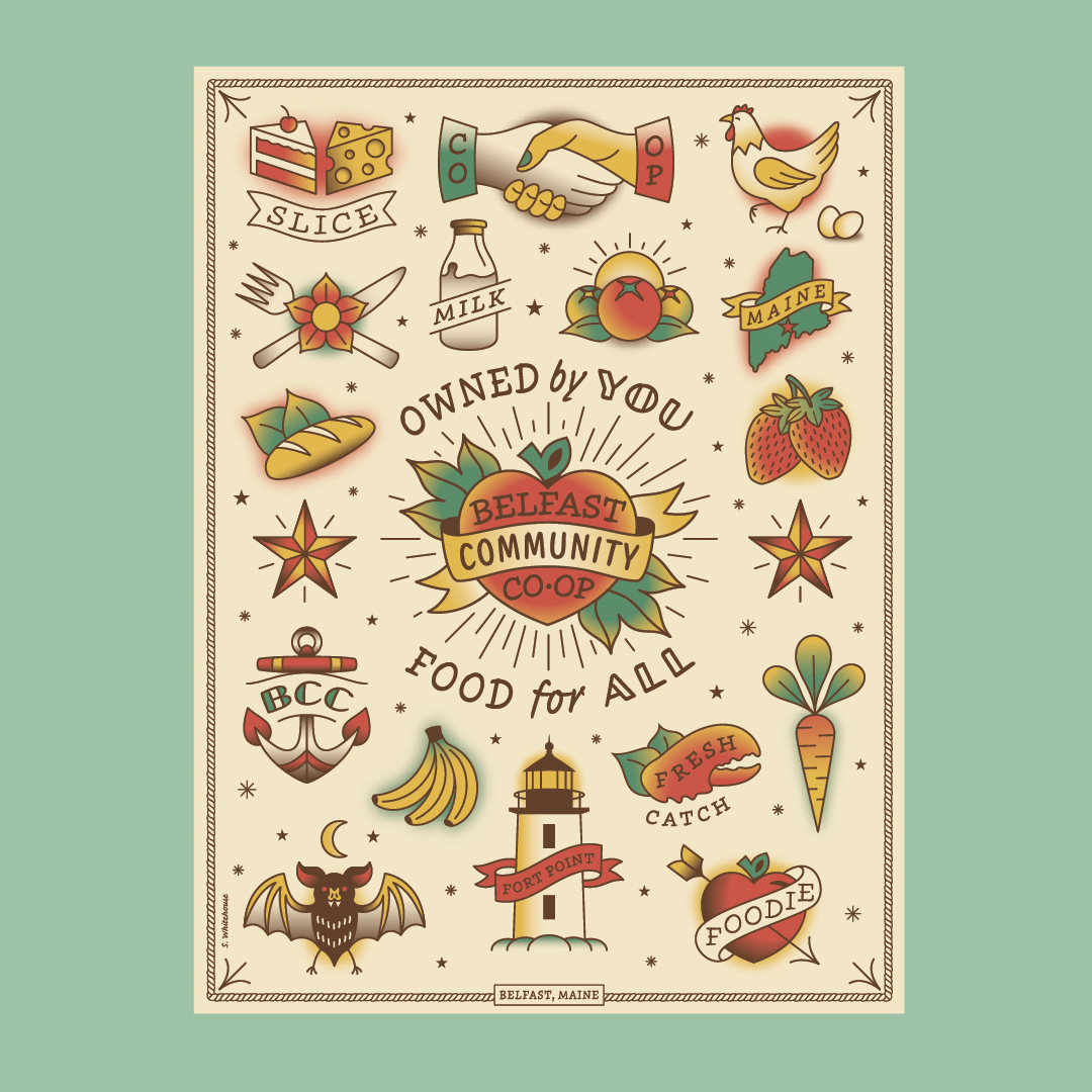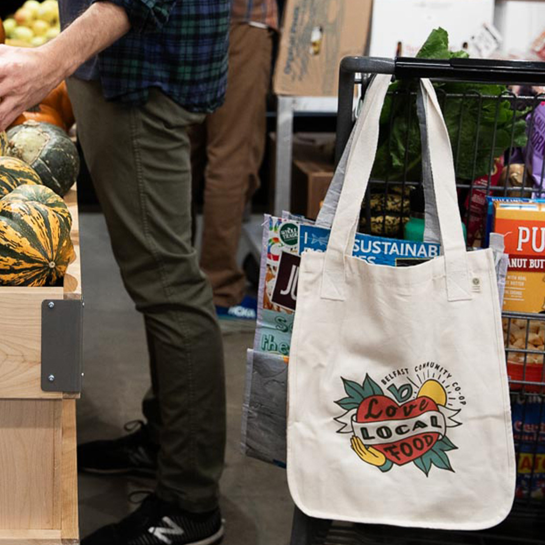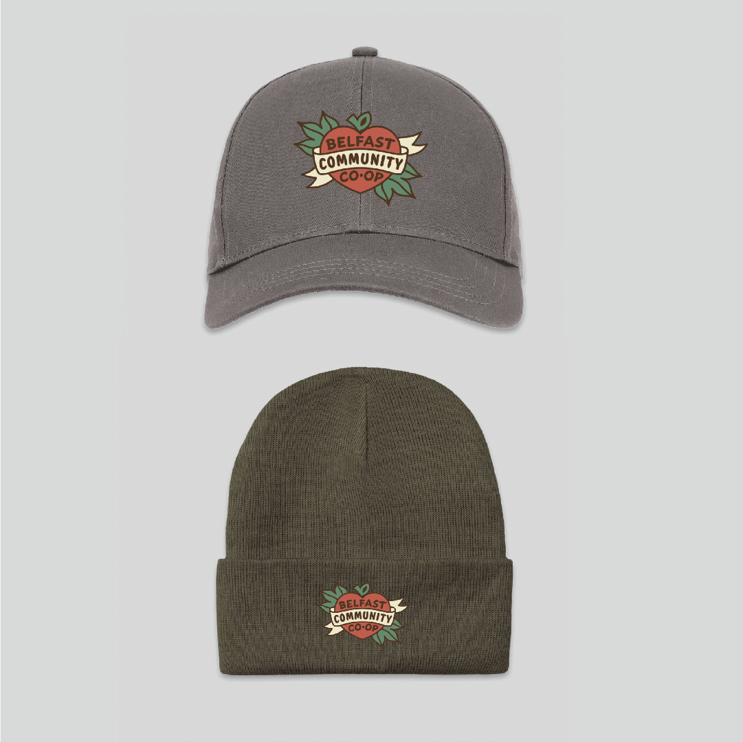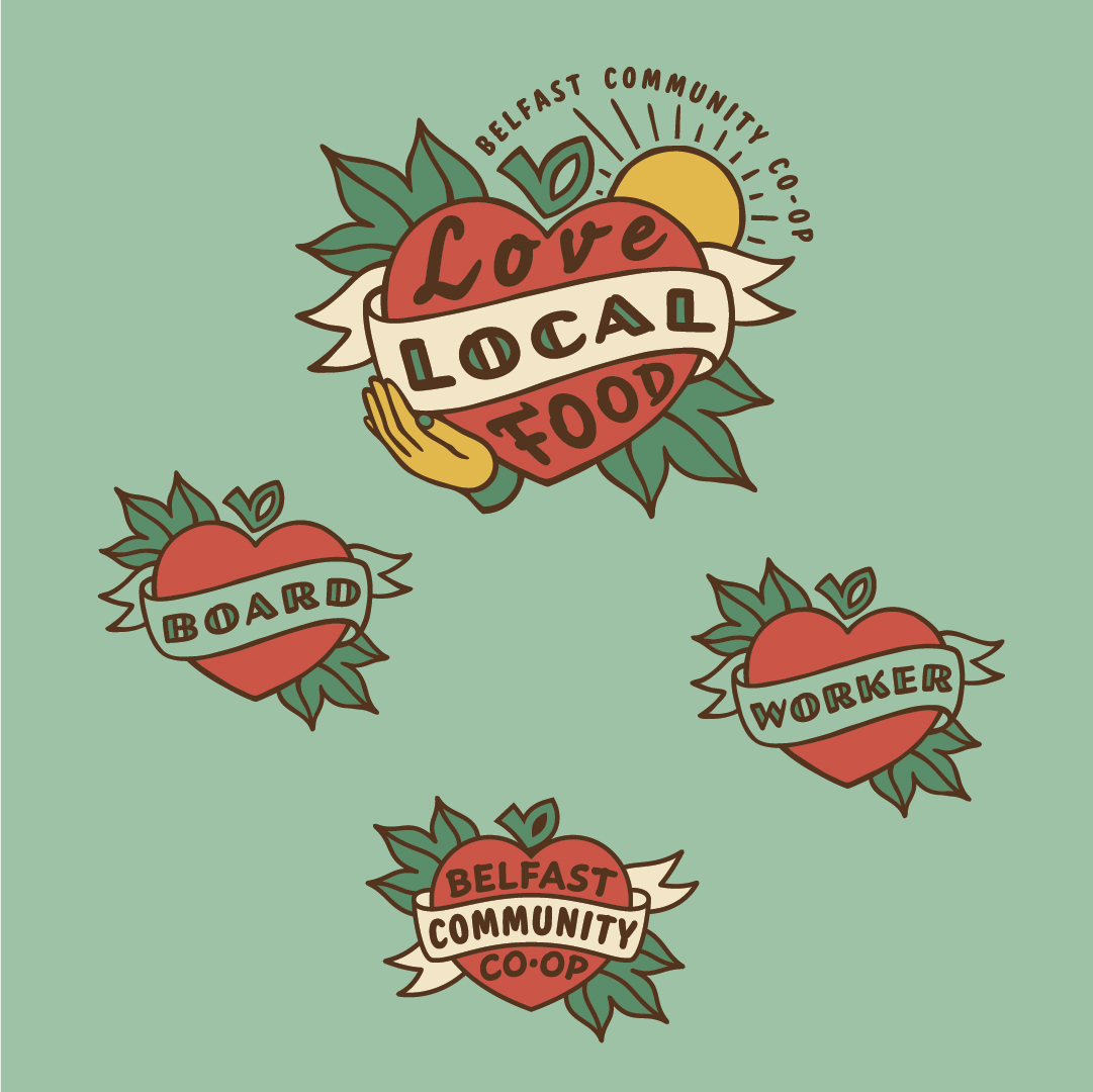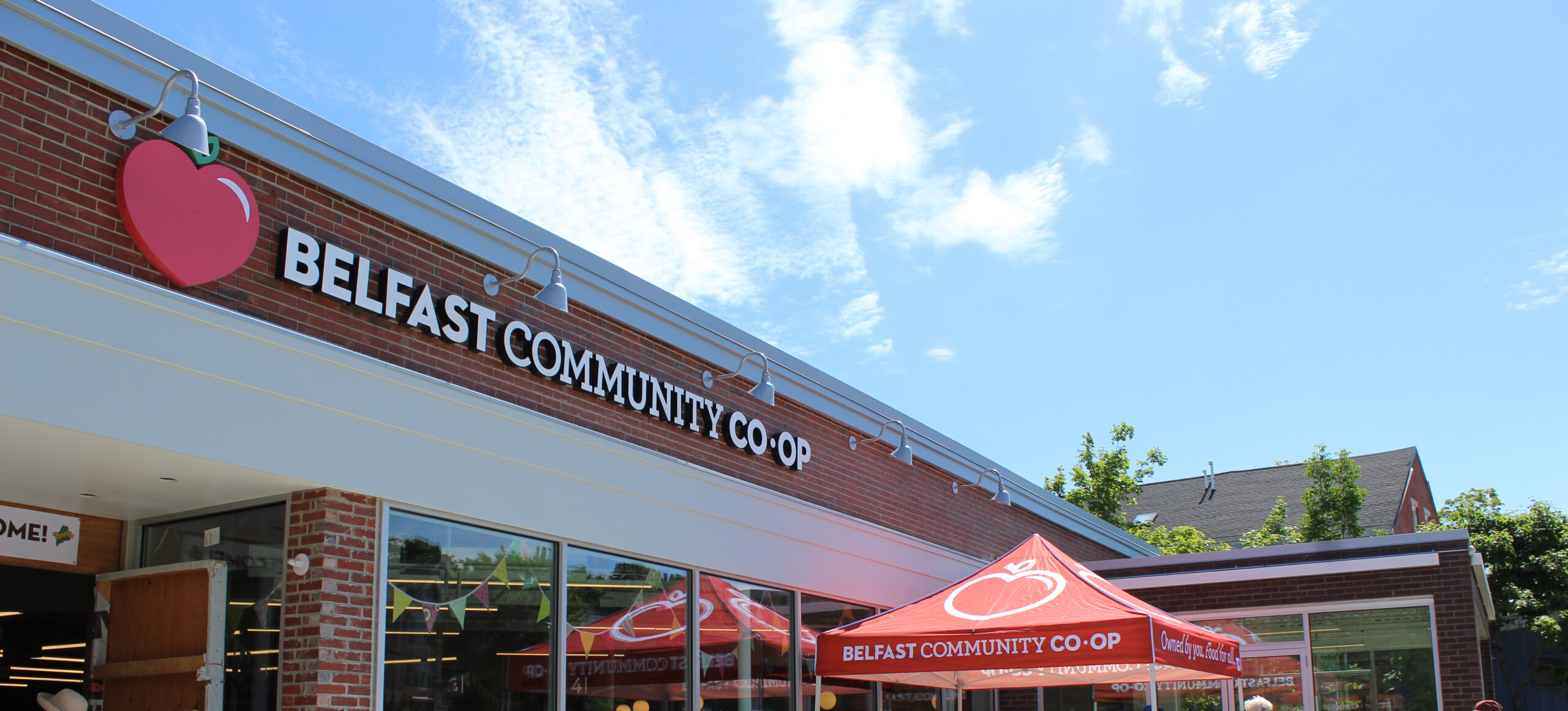


One of Maine’s most beloved food co-ops was seeking a complete brand refresh to coincide with a major facility renovation. Leadership was open to changing the logo, color palette, messaging and name to better reflect the store’s goals. At the same time, they needed to be careful not to alienate their passionate core membership. In everything Pica did, we carried through key brand elements of the Co-op’s history—an apple, a phrase already in use–and transformed them into the bridge between the store’s past and its future. In this way, we strengthened the brand overall, satisfied the Co-op’s loyal customers and broadened its appeal, all at the same time.
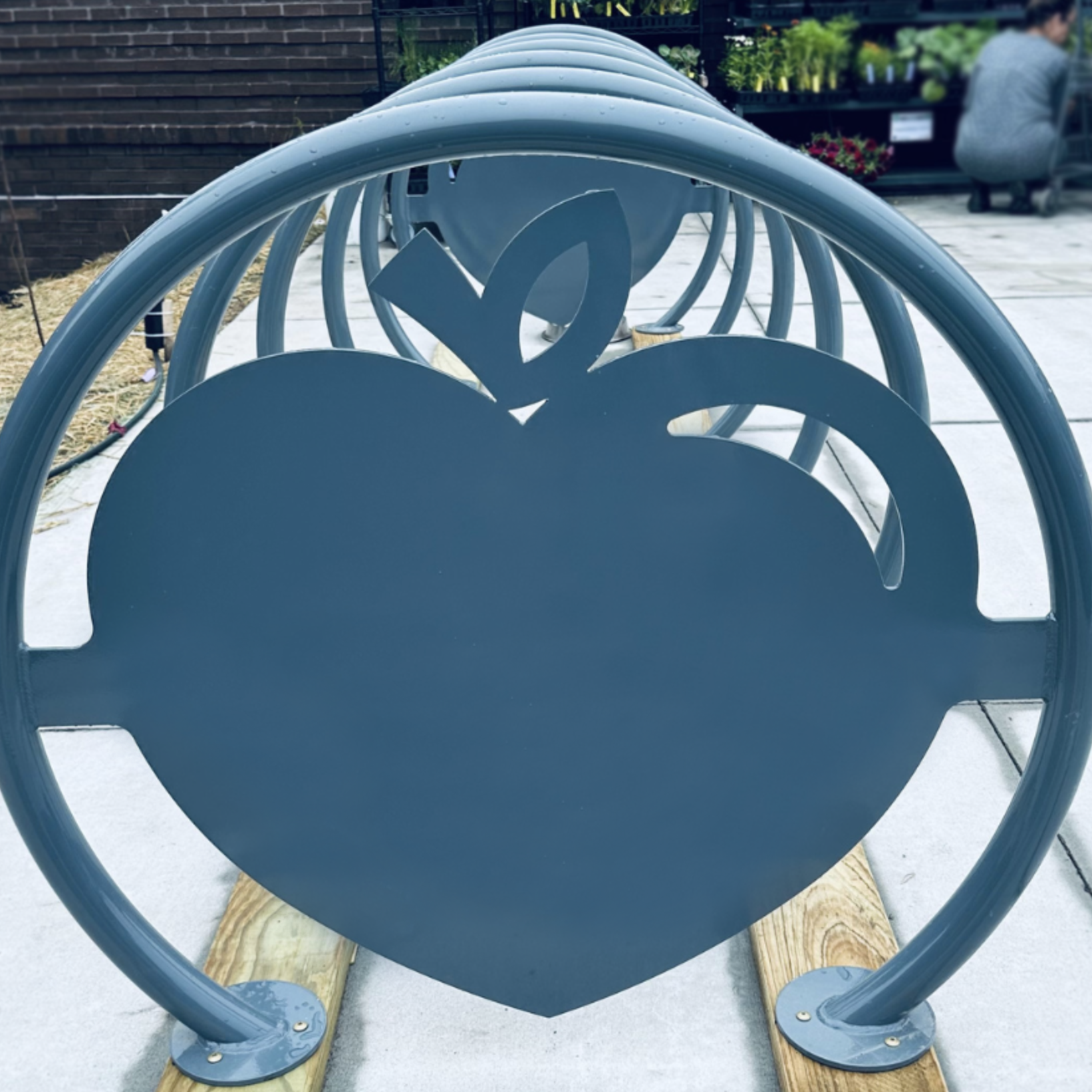
Fun fact: The Belfast Community Co-op loves its “heart-apple” logo mark: it’s even the design for the custom-fabricated bike rack in front of the store!